Home › Forums › ROV › International ROV Related Associations › IROVA Logo and badge design – need some ideas
- This topic has 73 replies, 14 voices, and was last updated 14 years, 6 months ago by
Scott Beveridge.
-
AuthorPosts
-
July 2, 2010 at 3:26 pm #3635
James McLauchlan
ParticipantIROVA Logo and badge design – need some ideas.
Anyone on a bit of weather down time or sat at home twiddling their thumbs fancy a stab at the above?
If you do have a go you can attach the a file to a reply in this thread.
All input appreciated.
July 3, 2010 at 7:03 am #28485thomas
ParticipantThis is the first stab at a logo or badge inclusion courtesy of a south american resident and founder member.
Hmm…. was going to copy and paste it on here but unable to do so,however it is an outline drawing of a Panther Plus with manips hanging down.
Its a good start and it has given me an idea ,that I hope one of you cleverer than me people, could maybe have a look at.
Is it possible to create an outline drawing of a small workclass using the letters IROVA as the frame of the sub?
Now there is a challenge for those off duty boring hours when you are not asleep.
July 3, 2010 at 7:07 am #28486James McLauchlan
ParticipantNow there is a challenge for those off duty boring hours when you are not asleep.
Or for those on duty boring hours to stop you nodding off!
July 3, 2010 at 8:23 am #28487Sit Rep
ParticipantI’m not bad with tech drawings but graphics…spectacularly uncreative; I’ll suggest a concept perhaps.
Foreground: a yellow/black (fairly standard) generic work-class ROV with 5 & 7 function
Mid-ground: a wire-frame globe (showing international aspect) in white or perhaps, even, a compass rose
Background: light blue over a darker blue with a "wavy" top (representing sky over sea)
Logo: curved around the top or bottom (preferably top as more aspirational) of the whole thing preferably in a modern (progressive..) yet readable font
July 3, 2010 at 9:13 am #28488thomas
ParticipantWow sitrep sounds good but way beyond my ken.
Would love to see it.
Dont forget to register if you or your colleagues wish to support us.Or just spread the word that this association will happen.July 3, 2010 at 2:19 pm #28489James McLauchlan
ParticipantAs a reminder anyone can attach a .jpg image to a post for people to view.
July 3, 2010 at 3:52 pm #28490Mark DuPriest
ParticipantNot a bad ROV representation. Block out the guts, wash off the OI magnum graphics and there exists a large area to display IROVA in perhaps bright red.
The manips need better coloring to highlight them.http://www.serpentproject.com/missions/norway/morvin/images/Magnum_ROV.jpg
magnum_rov_213.jpg 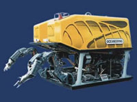 July 3, 2010 at 4:39 pm #28491
Sit Rep
ParticipantThanks for jpg Lucas sort of shot I was was thinking of for the foreground.
I think we have to carefully make a "generic" ROV, don’t want to piss anyone off! So if anyone can Photo-Shop TM etc that would help.
Now, I was thinking the mid-ground should be an orange peel style world view, that way we show all of the world and no-one can claim bias? You know the map that sort of looks like three ellipses.
Happy thinking!
July 4, 2010 at 9:22 am #28492Mark DuPriest
ParticipantYes, sitrep that sounds good.
Perhaps INTERNATIONAL at the top
As I suggested ROV imposed on the ROV’s floatation block and ASSOCIATION at the bottom of the badge.July 4, 2010 at 3:04 pm #28493James McLauchlan
ParticipantIf someone is going to have a bash at the logo… I would suggest:
‘International’ should be curved downwards over the top
ROV horizontally on the ROV buoyancy (as suggested)
‘Association’ curved upwards at the bottom
This would allow for the designed to be incorporated into a website logo, letterhead and stitch on circular badge.
I agree that the ROV should be more generic.
Glad to see people picking up on this :tup:
July 5, 2010 at 4:39 am #28494Robert Black
ParticipantThere used to be a picture doing the rounds of a ROV supervisor wearing nothing but elvis shades and a Zebra print posing pouch with his foot on a Panther plus. I think this should be found and considered as an entry. Also if it is found, could someone send me it as it was me and I’ve lost my copy?
July 5, 2010 at 5:37 am #28495Scott Beveridge
ParticipantIf someone is going to have a bash at the logo… I would suggest:
‘International’ should be curved downwards over the top
ROV horizontally on the ROV buoyancy (as suggested)
‘Association’ curved upwards at the bottom
This would allow for the designed to be incorporated into a website logo, letterhead and stitch on circular badge.
I agree that the ROV should be more generic.
Glad to see people picking up on this :tup:
That sounds like a good one James.
July 6, 2010 at 10:58 am #28496Sit Rep
ParticipantSuggestion #1
Just had a quick bash using AutiCAD and Word.
The ROV is a bmp exported from AutoCAD into Word.
OOPS and then converted to a jpg to allow me to upload it!
It’s a roughy but looks to me like what James was describing.
Any other takers?
rov_538.jpg Description: ROV.bmp drawn in AutoCAD suggesting a very generic ROV RHS view 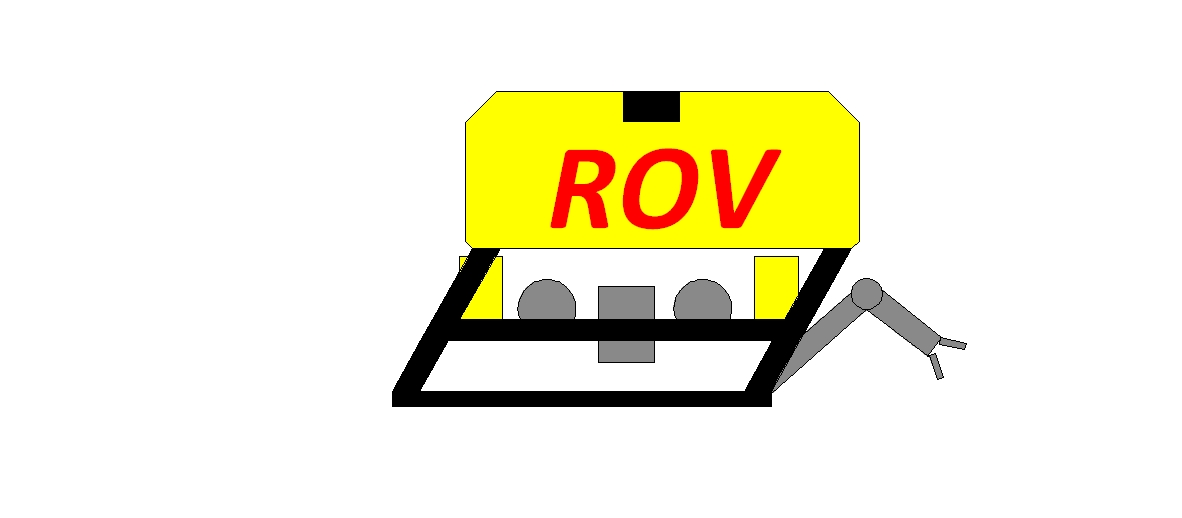
badge_812.doc Description: Word document with embedded bmp for IROVA badge Filename: badge_812.doc 
DownloadJuly 6, 2010 at 12:38 pm #28497James McLauchlan
Participantsitrep69
Thanks for your valuable input.
I’d say that is a good start as we have to consider it being used in web, letterhead and stitched (badge) or sticker format. It’s a basic generic ROV image we need and that is what you have offered us.
Any further comments?
July 7, 2010 at 12:04 am #28498Scott Beveridge
ParticipantSitrep,
Looks good, not too complicated to print. And James’ curved International and Association on the top/bottom…
-
AuthorPosts
- You must be logged in to reply to this topic.


