Home › Forums › ROV › International ROV Related Associations › IROVA Logo and badge design – need some ideas
- This topic has 73 replies, 14 voices, and was last updated 13 years, 8 months ago by
Scott Beveridge.
-
AuthorPosts
-
August 8, 2010 at 9:55 pm #28529
Lemmin
ParticipantSuggestion #13
ROV superimposed on the world, with the word IROVA below in black font. I quite liked the look of the vehicle on top of the world map on this one.
rov_on_top_of_world1_small_403.jpg 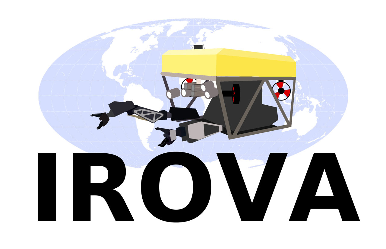 August 8, 2010 at 10:03 pm #28530Participant
Suggestion #14
Some text effects – I thought maybe the black was a bit harsh, a blue might be nicer…
irova_logo_rov_ontopof_world_over_letters_bluefont_small_152.jpg 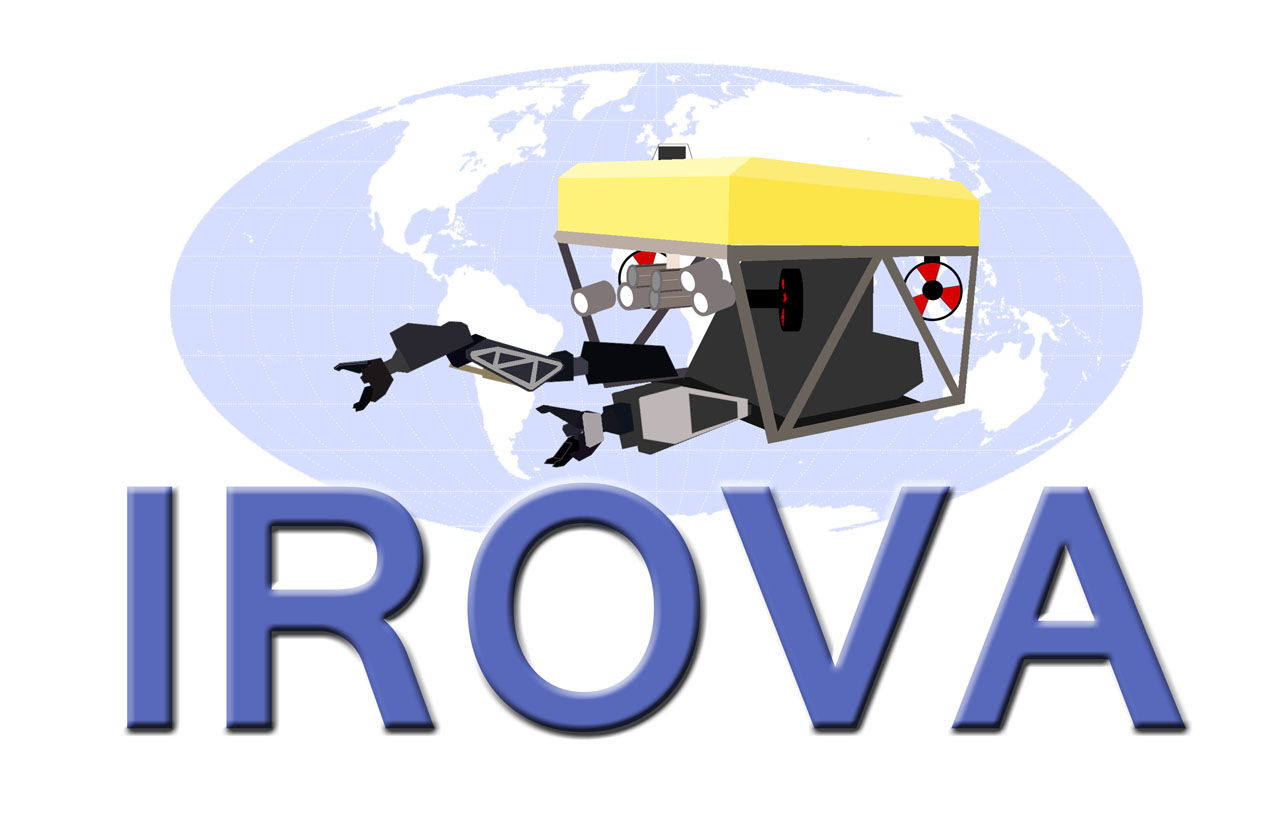 August 8, 2010 at 10:40 pm #28531Participant
Suggestion #15
Ok, now it gets a bit silly (sorry) – I thought the ROV looked a bit like a heraldic animal, so I thought maybe we should have a heraldic crest or shield!
This one has four blank areas, we could put something in each to symbolise various things – maybe the areas ROV work in (a rig, a boat, a wreck etc?) or maybe we could put something in to symbolise the purpose of IROVA – better pay and conditions, educating people, safety and research or something.
I know its a daft idea, I just couldn’t resist making a quick one once I’d thought of it!
irova_heraldic_chrest1_small_209.jpg 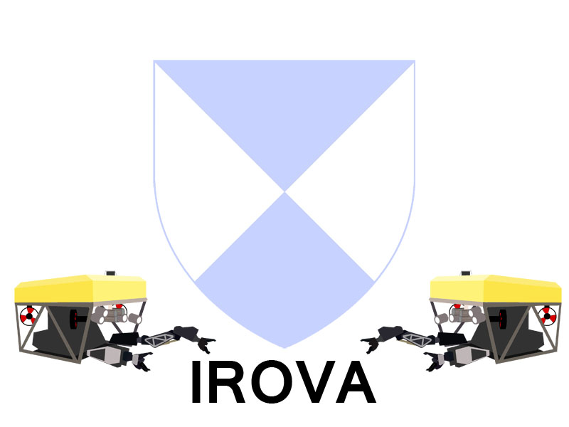 August 9, 2010 at 4:00 pm #28532
James McLauchlan
ParticipantLemmin
Thanks for the input. Starting to build up a nice collection of ideas now. :tup:
August 16, 2010 at 4:40 am #28533thomas
ParticipantJust a note to ask if anyone can finalise the logo and we will start to make use of it.
August 16, 2010 at 10:27 am #28534R2D2
ParticipantBeaut’ guys.
Would I be silly to ask if there are any ‘verts’ required for this fine machine?Cheers
August 16, 2010 at 10:41 am #28535Scott Beveridge
ParticipantI say stick with the globe idea re: International… 5th & 6th posts up
August 16, 2010 at 11:21 am #28536ParticipantI’ve added suggestion numbers to each post that has an image attached to make it easier to discuss the various options.
Scott.. maybe you could reference those in your post to help clarify?
I like suggestion #9 (with the wording changed to ‘International ROV Association’)
I also like suggestion # 12
What ever we settle on, if need be, the final design can be polished up, colours, scaling etc. by a graphics design company.
August 16, 2010 at 1:38 pm #28537ParticipantI’ve added suggestion numbers to each post that has an image attached to make it easier to discuss the various options.
Scott.. maybe you could reference those in your post to help clarify?
I like suggestion #9 (with the wording changed to ‘International ROV Association’)
I also like suggestion # 12
What ever we settle on, if need be, the final design can be polished up, colours, scaling etc. by a graphics design company.
Good point… I like Suggestion # 14 and #13 being my second choice.
August 16, 2010 at 4:10 pm #28538ParticipantI’ve come into this late as I’ve been pre-occupied with searching in vain for work at the now impoverished rates. Nothing happening on that front so I’ll pop my head in and mention a little input for you to contemplate;
I do far prefer the logo which represents the generic rov in front of the globe, above the blue lettering. Nice work fellas.Here’s the cause for my hesitation. Hopefully it will become a well populated emblem, thus the inevitable badges, tee-shirts and golf-caps etc will proliferate. (Beads for those project managers and personnel co-ordinators in the office, not forgetting all the cookies coming out of those fine training establishments.)
A logo such as this would be a difficult and thus expensive to reproduce on stationery, garments or even as a footnote on documents. Take for example the predominant reference in this discussion, ‘IMCA’, or any of the other major participants out there. They keep it pretty plain & simple. The less detail, the better. I imagine the intention of this topic is to agree on a contemporary/modern ‘brand’ or emblem which will endure.The other option is adopt two versions ? …… nah, too cluttered for me.
That’s my thought, I’m off to stand in the soup-line,
Adios.
August 16, 2010 at 5:10 pm #28539ParticipantSome good points on costs but given that, based on an international uptake, there could be a considerable volume discount involved plus production could well take place in Asia, costs might not be as probative as initially thought.
I do agree that one logo is the best way forward. Two logos would only weaken/confuse the branding/image.
August 16, 2010 at 7:10 pm #28540ParticipantRegarding costs for logos etc, I have a little bit of experience with getting stationary / newsletters / clothing made up for small companies.
In the past, it was often the case that the more colours you wanted on your stationary, the more it cost. These days, costs for stationary and business cards are normally the same regardless of number of colours (unless you go for a pure greyscale / monochrome logo). Most printing companies run stationary off on what amounts to large colour laser printers anyway, and its the same with business cards. If you go for really really high volume (tens of thousands or hundreds of thousands of units) then they may print using lithography, in which case more colours is more expensive, but the economies of scale only really start to work at well beyond the level we will be looking at since the initial set-up cost of a lithography run (having plates made etc) is quite high.
For clothing it is often the same deal – smaller runs of clothing are made using transfers, and the number of colours doesn’t matter too much (although you can save some money by using a coloured background fabric and a single-colour transfer). Larger runs are made by screen-printing, and some cost saving can be made by having less colours, but the initial set up costs mean this is only viable for thousands of units. Have a look at cafepress.com for an example, they can make full-colour T-shirts from around $19 with your own image on, or $22 with front and back images, and on production runs of 20+ its easy to get the price down further.
For embroidery, more than a single colour is very hard to do, but I’m not really sure where we would want to embroider our logo…
Generating a monochrome or black+single colour version of our logo would be possible, however I don’t think we would notice the cost savings for our relatively small needs at the moment.
LEM
Edit:
Cafepress Polo (golf?) shirt with logo £14 / $19: http://www.cafepress.com/cp/customize/product.aspx?clear=true&number=%20463798294
August 16, 2010 at 8:01 pm #28541Alpha
ParticipantSuggestion #16
Tried keeping the logo as simple as possible, still needs sharpening up. What do you think?
irovalogo2_108.jpg 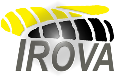 August 17, 2010 at 2:23 am #28542Participant
Tried keeping the logo as simple as possible, still needs sharpening up. What do you think?
Alpha,
Simple and concise… Could you try to incorporate a globe in the background? This simply implies it’s an international org. or assoc.
August 17, 2010 at 11:25 am #28543ParticipantIn order of appearance below:
Suggestion #17
Suggestion #18
Suggestion #19New versions incorporating globe.
irovalogo5_130.jpg 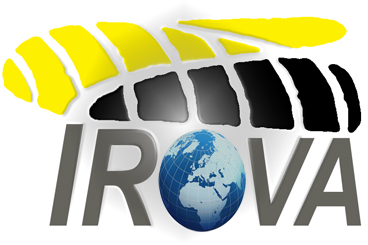
irovalogo4_157.jpg 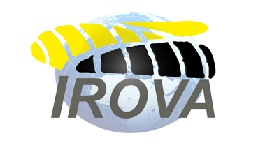
irovalogo3_956.jpg 
-
AuthorPosts
- You must be logged in to reply to this topic.