Home › Forums › ROV › International ROV Related Associations › IROVA Logo and badge design – need some ideas
- This topic has 73 replies, 14 voices, and was last updated 13 years, 8 months ago by
Scott Beveridge.
-
AuthorPosts
-
August 17, 2010 at 1:45 pm #28544
R2D2
ParticipantWho was that masked man?
Bravo
August 27, 2010 at 3:23 pm #28545James McLauchlan
ParticipantI’ve been asked by the IROVA co-ordinator to try and get a little more input on this thread as they are getting close to waiting to finalise a logo for the new IROVA website at http://www.IROVA.org
Further comments on existing images or additional new images would be most welcome.
We’ll have to close this thread in a couple of days and pass the information on to the IROVA webmaster.
August 28, 2010 at 5:18 am #28546Scott Beveridge
ParticipantSuggestion #20 & #21
This is a modification of Lemmins’ Suggestion #13 & # 14. Please download attachment.
irova_logo_rov_ontopof_world_over_letters_bluefont_small_2_170.jpg Description: Modified from Suggestion #14 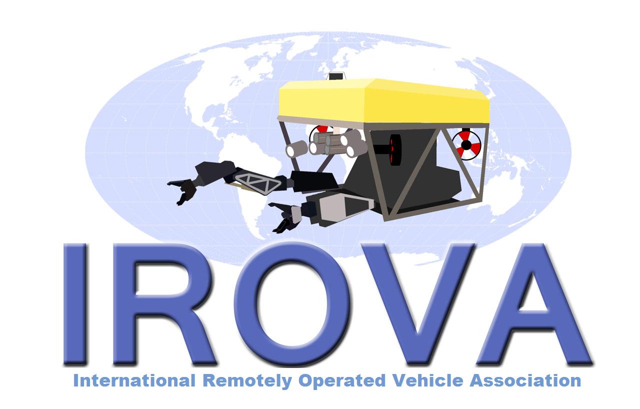
irova_logo_rov_on_top_of_world2_small_403_157.jpg Description: Modified from Suggestion #13 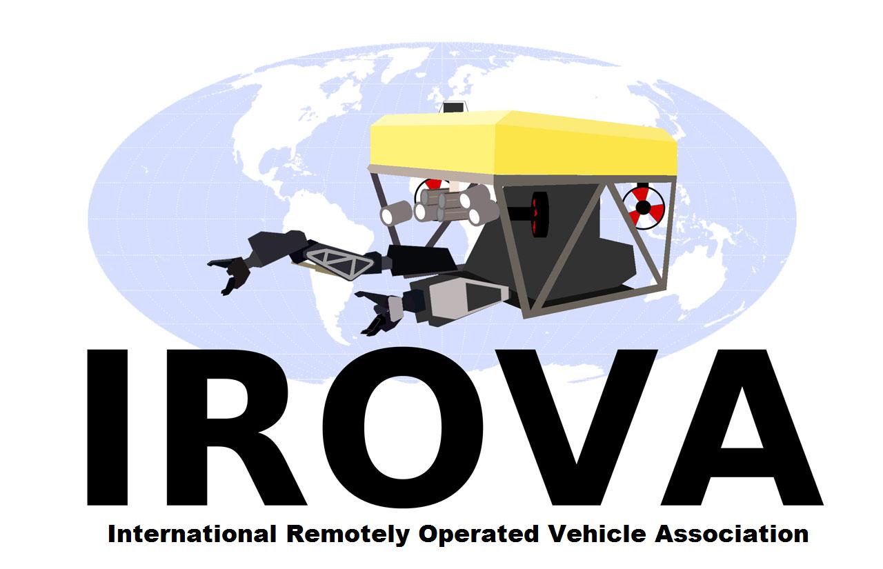 August 28, 2010 at 7:45 am #28547Participant
For a webesite logo
I’d be happy to see #21 adopted. Globe in the background, Black IROVA lettering and Black ‘International Remotely Operated Vehicle Association’ Lettering underneath.
It would work for the website and any letterhead/printed sticker type applications.
For a stitched (Cloth) logo’s the small lettering may need to be dropped but that’s no biggie.
August 28, 2010 at 9:32 am #28548ParticipantJames,
A bit of re-sizing would do for this… Anybody else have an opinion or different idea?
August 28, 2010 at 11:09 am #28549thomas
Participantwould it be possible to wrap irova around the world or the sub to make it more compact?
August 28, 2010 at 11:20 am #28550ParticipantRe: Suggestion #21, yes I agree… Lemmin you think the Mollweide globe projection could be reduced in size, the blue font (w/out shadow) can be wrapped on the upper part of the globe, with the BOLD / LARGER FONT IROVA being below the globe. Sorry, I don’t have time right at this moment to do so.
August 28, 2010 at 5:56 pm #28551Lemmin
ParticipantScot: yes, I’ll give it a go. I’ve got my own ideas about a logo specifically for the website, so I’ll fire up photoshop probably tomorrow and try out some of the suggestions.
LEM
August 29, 2010 at 1:42 am #28552ParticipantUnfortunately, I don’t have photoshop….
August 29, 2010 at 9:34 am #28553ParticipantScot: yes, I’ll give it a go. I’ve got my own ideas about a logo specifically for the website, so I’ll fire up photoshop probably tomorrow and try out some of the suggestions.
LEM
Nice one Lem
Thanks for giving something back to the community :tup:
August 29, 2010 at 7:00 pm #28554ParticipantScot, IROVA: something like this? It’s a bit messy, and I’m not sure I quite understood what you had in mind, but let me know if I’m on the right track…
irova_logo_oval_text_wrap_1_small_233.jpg 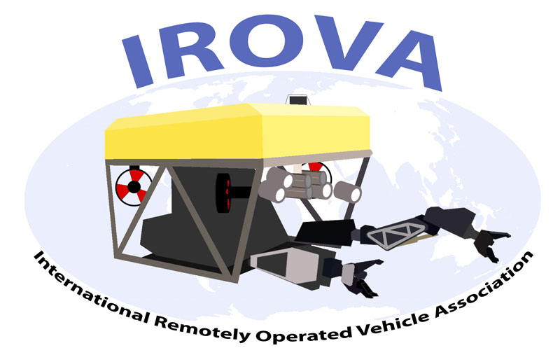 August 29, 2010 at 7:33 pm #28555Participant
Ok, here are my latest thoughts on a logo, now I’ve considered it from a website point of view.
The line can be continued right across the web page, letterhead, business card etc, or it could be fade to nothing on either side of the main logo (suitable for printing on fabric).
irova_logo_line1_small_306.jpg 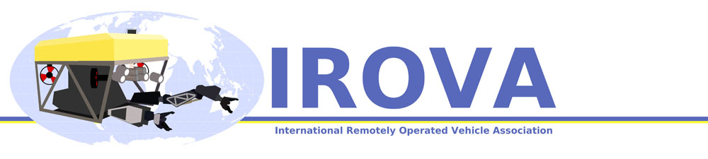 August 29, 2010 at 7:35 pm #28556Participant
Now with bluer blues, bolder lines and some shadows to give things more depth.
irova_logo_line3_small_199.jpg 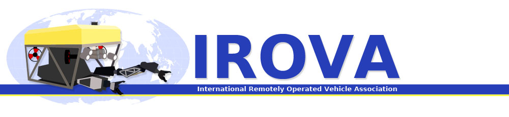 August 30, 2010 at 12:43 am #28557Participant
Lemmin,
That’s it dude! Suggestion 24 (bold lettering with the shadows)! The right side could be cut off a bit or cropped though. I like it / works for me!
Anybody else with an opinion of this logo? IAC and oldish members?
-
AuthorPosts
- You must be logged in to reply to this topic.